This is the third and final post discussing Security Metrics: Replacing Fear, Uncertainty and Doubt by Andrew Jaquith. As I noted, Jaquith makes some intriguing and vital points about the need for "good" metrics and "serious analytic scrutiny" to inform executive decision-making on issues of security, compliance, and risk governance. This is an especially important topic today, with organizations everywhere trying to figure out how to stay secure and improve compliance while cutting their expense budget.
Most organizations, when considering appropriate investment levels to deal with risk, are not lacking for data. But lots of data does not equate to relevant information required for sound decision-making. Jaquith's point is that information in the form of metrics -- good metrics, which he defines -- is lacking in many enterprises.
But once good metrics have been defined, how are they communicated to stakeholders? Jaquith dedicates an entire chapter to visualization. He starts by listing his six design principles for visualization of metrics:
- It is about the data, not the design (resist urges to "dress up" the data)
- Just say no to three-dimensional graphics and cutesy chart junk (it obscures your data)
- Don't go off to meet the wizard (or talking paperclips)
- Erase, erase, erase (removing tick marks and grid lines results in a crisp chart with few distracting lines)
- Reconsider Technicolor (default colors are far too saturated, and should be muted. Consider a monochromatic palette)
- Label honestly and without contortions (pick a meaningful title, label units of measure, don't abbreviate to the point where the meaning is not clear)
Like me, Jaquith is an admirer of Edward Tufte, author of several books about information visualization including the classic The Visual Display of Quantitative Information (1983, Cheshire, CT: Graphics Press). According to Tufte, a key to effective visual displays is understanding the goal of your presentation. In Tufte's own words:
At the heart of quantitative reasoning is a single question: Compared to what? Small multiple designs, multivariate and data bountiful, answer directly by visually enforcing comparisons of changes, of the differences among objects, of the scope of alternatives. For a wide range of problems in data presentation, small multiples are the best design solution.
Hence, we have small multiples as a visualization strategy. Here's an example:

From this display, one can look at different categories (in this case, departments) to view comparative performance over time. Once can readily imagine security/compliance applications for this approach, such as dormant accounts by resource, or excessive access rights by department.
In his book Beautiful Evidence (2006, Cheshire, CT: Graphics Press) Tufte introduces a refinement to this concept called the sparkline, which he defines as "small, intense, simple datawords". The example Tufte uses to explain the sparkline concept is a patient's medical data, taken from Beautiful Evidence:


Besides Tufte's small multiples and sparklines, Jaquith's visualization suggestions include indexed and quartile time series charts, bivariate charts, period-share charts, treemaps, and Pareto charts. The key point is that there's not a single graphic approach that works in all cases; one needs to determine the essence of what is being conveyed. The audience almost always consists of busy people, often executives, who need to have information presented clearly and in context. It doesn't do anyone any good to be able to point out after a security event that the "smoking gun" data had been seen, but it was either lost in the noise of too much data, or its significance was not clear.
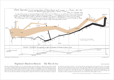
P.S. It's not necessarily relevant to this post, but my favorite graphical display of quantitative information is an advertisement for one of Tufte's books that regularly appears in Scientific American and The Economist:

No comments:
Post a Comment